
First of all, this requires that you have some version of Photoshop. I'm sure if you have Elements or an earlier version of Photoshop, it will all translate somehow, but I used Photoshop CS5 to create this tutorial, which you can download a trial version of HERE. You can use it for 30 days, and if all you want to do is make a blog banner and move on with life, then don't go out and buy the program, just download the trial (if you want to purchase it, you can get a significant discount on it if you are a teacher or student).
Secondly, you are going to need some digital scrapbook paper/kits. You can get TONS of free ones online, just google search free digital scrapbook paper or digital scrapbook kits. My favorite place so far is The Shabby Princess. They have entire kits you can download and use whenever on their website for home personal use (this tutorial will also lend itself very well for a good ground-base for photoshop-ing your own digital or printable scrapbook pages- heck, make a book out of it, it's all the same!)
Here's where you start. Sign in to your blog, click on the design button, then click the "edit html" button. Scroll down until you find the highlighted section below. The text you are looking for will look something like this:
#header-wrapper {
width:660px;
margin:0 auto 10px;
border:1px solid $bordercolor;
 This little bit of information tells you how many pixels wide your blog banner needs to be in order to fit in the frame for whatever template you have. See how in mine, it says "width 660px". That means it needs to be 660 pixels wide (I said this was for dummies like me, right??). Notice how it doesn't tell you the height it needs to be- which means there is no set boundaries, you can make it as tall as you want. For this tutorial, I set the height at 200 pixels, that's generally a good place to start.
Now open photoshop, click "file", then click "new" and enter in the dimensions as shown below. Make sure it's set to "pixels" (not inches or picas or anything else), and make sure your resolution is set to 72 pixels/inch.

Open her up. You should now have a white rectangle on your page (success!). Now you want to be able to access those digital scrapbook kits. If you went to The Shabby Princess, here is where the kits are located. The kit I used for this tutorial is called "Harvest Spice".

Next, click "file", then "open", then browse the folder you downloaded your kit to. Select a paper you would like as your background. Open it.
 This next part is a little complicated, but just follow the directions and pay attention because you will use the same strategy to put any of the images from the scrapbooking kit into your banner. It's easy once you get the hang of it.
Find the rectangular select button on the top left corner of your screen. It looks like a dotted rectangle. If for whatever reason that button is not there (like there's a dotted circle or line or something like that), right click the second icon down from the top in your tool bar to the left and you will see it there. Click it.
 Now select an area of the page you would like to use as your background. You only need a small portion of it, don't select the entire page, you will see why in a moment. Select the portion by clicking on the image and dragging it into a small rectangle.
Once you have your rectangle selected, click the "drag" button (the very top button in your toolbar on the left).Drag the arrow to your selction and click in the center of the rectangle you selected, then drag it into the banner, as shown below.

Now you will see that the image you put in your banner is GINORMOUS (now aren't you glad you listened to me and didn't select the entire page??). There is an easy way to fix this. Press Ctrl and the "T" button at the same time. This selects the entire portion you dropped into your banner and gets you ready to resize it.

Now drag the image down and over until you can see the top left corner. You are now in a position to resize your image. PLEASE NOTE: you want to resize the image TO SCALE, and to do this, while resizing any portion of the image, you MUST PUSH SHIFT while dragging the image to resize. Otherwise it will not resize it to scale and you will have a distored image. This is particularly important when resizing photos, so remember this.
When you are finished and you have it as big as you want it, click the check mark in the top left corner of your page.

Now you can open up any of the papers and add them however you want to since you know how to drag them into your banner and resize them. In the image below, I selected another portion of a different paper and used it on top of the previous one, so the previous now serves as a border. Just for your information, when I resized this one, I did not do it to scale because it was too complicated, but because it was a simple pattern, it didn't particularly matter if the green checkered paper was slightly distorted or not, it still looks like green checkered paper. You do what your heart tells you, you are the artist, the creator: CREATE.
 In this kit, there is a frame, let's add it to our banner and see how to add some pictures to it. Open the frame and drag it into your banner, just like before.
 Resize. Put it where you want it. Oh so pretty.

Now let's open a couple of pictures. Click "file" and "open", then browse your computer for wherever it is that you keep your photos. Click and open one you like.

Once the photo is open, click the "drag" tool (very top icon on the left) and drag the ENTIRE image into your banner (or if you only want part of the picture, like a face, use the rectangular select tool, just like to did to your paper, and select what part of the image you want, then use the drag tool and put that part in your banner just like before...see a pattern emerging here? This open, drag, resize thing is amazing...)
Resize and place it over the frame. You'll notice that a) it's not tilted in the right direction (this may not be an issue if whatever you are using for a frame does not require tilting, but it's good to know how to do this incase you need it later) and b) the picture is over the frame and it looks...just...not right. Can't leave it like that, right? Fear not.

Over on the right-hand side of your layout are the "Layers" *cue angels singing*. Layers are important because it shows you what pieces of your project are where and when you select one of them, you can only work on that one layer (like if you are resizing or painting on it or texting on it or whatever). Now, let's get that frame over the picture instead of the picture over the frame: the layers go in order from top to bottom, so just like if you were stacking paper on top of each other, the layer on the very top would be what is at the top of your stack. In this case, the frame is below the photo, so we just need to switch them! Click on the frame and drag it up until you can drop it above the layer that contains your photo, as seen below (I know you are jealous of my arrow making skills...if you can tell, the red arrow on the left is instructing you to switch the layers).
 Now we need to tilt it so that it fits the frame a little better. We do this by, once again, pressing the ctrl button and the "T" button at the same time. If you drag your cursor above any of the corners of the photo (or image, if you want to tilt anything, you do it the same way) and a little curved arrow (that looks like the one seen in red below, only yours will be black...and nicer looking) will appear. Click that and while holding it, you can drag up or down and it will tilt the photo up or down for you. Magic!
 Voila. Picture tilted. You are now enabled to conquer the world.

You can add another photo the same way! Hooray!

Now you can add text! Click on the layer you want to add text to (in my case, it was the layer that contained the green checkered paper), then click the Text tool in the tool bar to the left (a little below halfway down, I think). Make a box in the area you want to add text to. To change the color of the text, click on the color box at the bottom of the toolbar, and this menu will appear. Drag your cursor over to your banner and a little eyedropper will appear: if you hover the eyedropper over any of the colors in your banner and click it, it will bring that color up for you in your color menu. I used the dark green in my striped paper. You can use any color you want. When you get the color you want, click "ok".

To move the text, click the drag button, circled again below. To adjust size, highlight the text and then you can type in any size you want in the text toolbar above, OR you can click the button that has a bit T and little T right next to each other that I handily circled for you, and while holding it, drag to the right or left to make it bigger or smaller and it will grow or shrink for you as you do it so you can see exactly how big you want it. Marvelous.
 Now you can add flowers, stitches, buttons, whatever your kit or paper or anything has in it to your banner. Again, just open it, use the drag button and pull it into your banner, then resize. Bam. Anything you want. Let your embellishing spirit roar. Here are a couple things I added to mine in order...
Flowers
 Cute little stitches that make it look as though I actually sewed the thing together like real scrapbook paper (included in the "Harvest Spice" kit). So clever.

Buttons

Now you look over to your layers tab and you likely will have more layers. Like a lot more. Let's simplify, shall we? See the little circle with the X in it in the image below? Right click on this area and a list will appear: at the bottom of this list, click "flatten image". This flattens all your layers into one simple background.
 Ah...much better.
 Now you are ready to save!! (Actually, you and I probably should have done this to begin with...but you know me, always ready to lose all my material when my computer freezes...I love doing everything over and over again because I forget to save...ho hum...). Click "file" and "save as" and find a good place to save this sucker. And make sure you save it as a JPEG, as highlighted below.

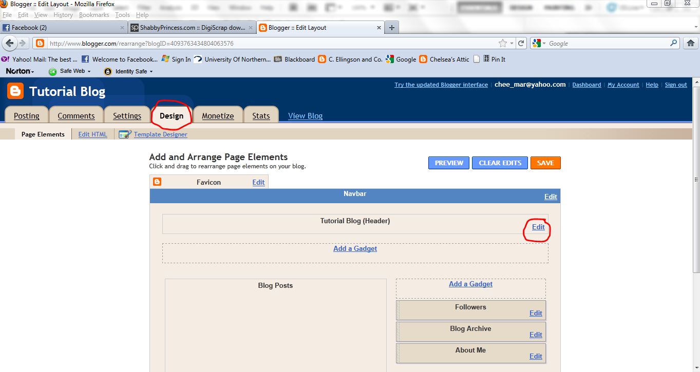
Now go back to your blog, click the design button again, and it should bring you to your "page elements". On the blog header part, click the edit button, as shown below.
 Delete whatever fru-fru you have there already. Then browse for your beautiful banner that you have now created. Open it!
 It will show up as your header- make sure you click the button that says "instead of title and description" (you'll see why when you open your blog if you don't do this). Then click "save".

You will be brought to this page where you can click "view blog".

Bada bing, bada bang, you have your blog banner! I just put it on my personal blog to show you what it would look like, but your background would ideally match better than this one. :-)
 NOW. If you are REALLY motivated to do the rest of your blog the same way, and want to try to fry your brain some more, go to this tutorial to see how you can make your blog background match your blog banner. I haven't yet figured out how to change the widths, which I would dearly love to do so I can make my pretty pictures bigger, but this will have to suffice until then. NOTE: there is an option at the bottom of your "edit html" page when you are designing that allows you to return to the old templates so you can start with the actual "minima" template when doing this. That made my process go much smoother when I figured that out.
Hope you had fun and share this with your "ounce of technical and creative savvy" friends!
And I am bowing out for the evening. WHOOSH.
2 comments:
I'm going to put this tutorial to a true test. I haven't actually made my own banner before, but I'm going to. So I'll give you a real reveiw when I get that taken care of. Thanks!
Cool. I scrolled through it fast, and it looks good. I hope to make a new something for the bottom of my blog (it still has my pregnancy pictures), maybe this weekend, and I will test the steps. Looks pretty much like what I do when I make my headers. I have been a bit minimalist lately with my headers becauase I have so many awesome pictures (That you took!) so I don't need scrapbooking stuff. Another note, When I was into digial scrapbooking I downloaded a bunch of stuff for free from various places and we are using some of it to make the "face of the firebird" each week at school. Funny. OK, sorry for writing so much. I will test your tutorial soon and post back with more thoughts.
Post a Comment